We’re always trying to enhance our software to make it easier to navigate. Recently, we introduced a new menu system in SydneyEnterprise, GeniePlus, and Argus. It makes great use of “screen real estate” while giving you lots of choices, and personalization via “Favorites.”
The new menu provides consistent, globally-accessible navigation to all areas of each product, with a structure that is carefully organized to provide quick access with meaningful top-level categories and functionality that is grouped together.
“I’ll gladly pay you Tuesday for a hamburger today…”
Our new menu is definitely not Wimpy, but it IS designed as a “hamburger menu”—just three lines stacked on top of each other. It’s located at the top left corner of each page…
Click to play
…and clicking on it causes it to slide out from left to right. (click the video above to see it in action)

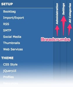
Folders allow you to drill deeper into the menu structure. “Breadcrumbs” (vertical bars and text to the right of the menu) allow you to jump back and forth in the menu structure.
Would you like fries with that?
In addition to the clean and easy navigation, there are many other menu enhancements to note, including:
- Favorites, managed per user, make it even easier to move between commonly accessed areas.
- The welcome message at the top right of every page will display the account you are currently using, and hovering over it will show you options to add the current page as a favorite, change your language, or log out.
- Portals can now be included in the menu, allowing easy access if you have multiple portals.
- Security for the menu can be easily configured via Settings->Administration->Security->Menu. There are three menu concepts that can be secured:
- Template: Template security configured from the menu will have the same impact as adjusting template security directly from Settings->Administration->Templates.
- Page: Pages can now be configured to have page level security. Page level security will be applied wherever the page appears in the menu.
- Folder: Folder security is used to restrict access to all child menu items of the folder.
Sometimes, looks do matter
You can customize the menu appearance whenever you want by modifying your theme profile; you will be able to change the font and colors with just a few clicks and keep everything in line with your departmental brand identity.
Finally, most areas of the product are accessible with a unique, cleanly-formatted persistent URL.
These are just some highlights—if you’d like to see our enhanced menu for yourself, as well as taking a look at other global navigation improvements, please contact us for a demo! We always love to hear from you. And of course, your suggestions and priorities always inform our R&D strategy.


